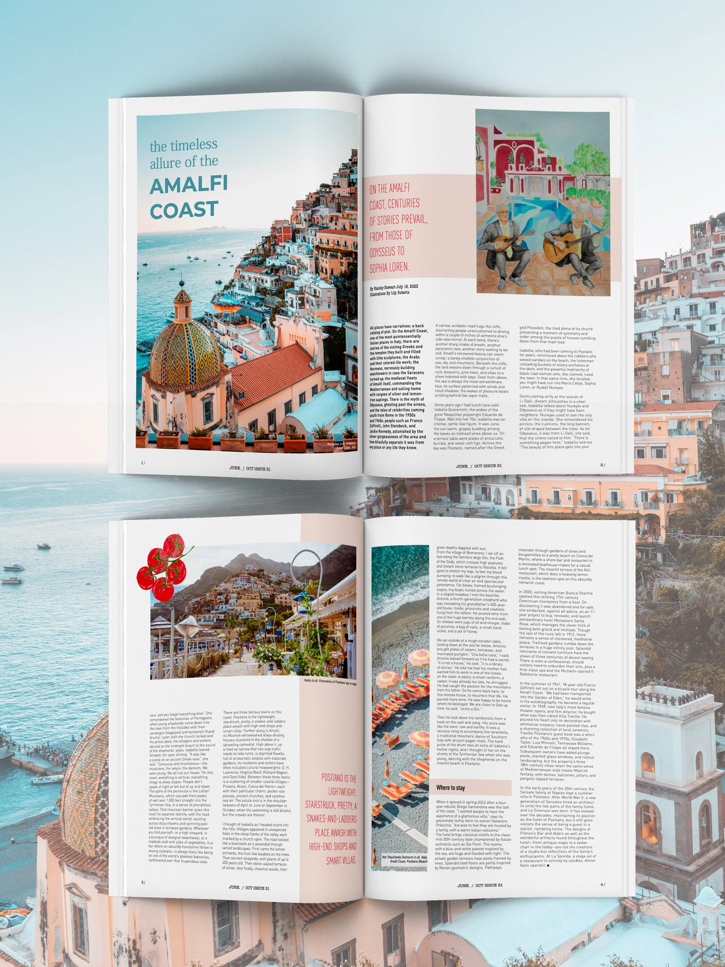
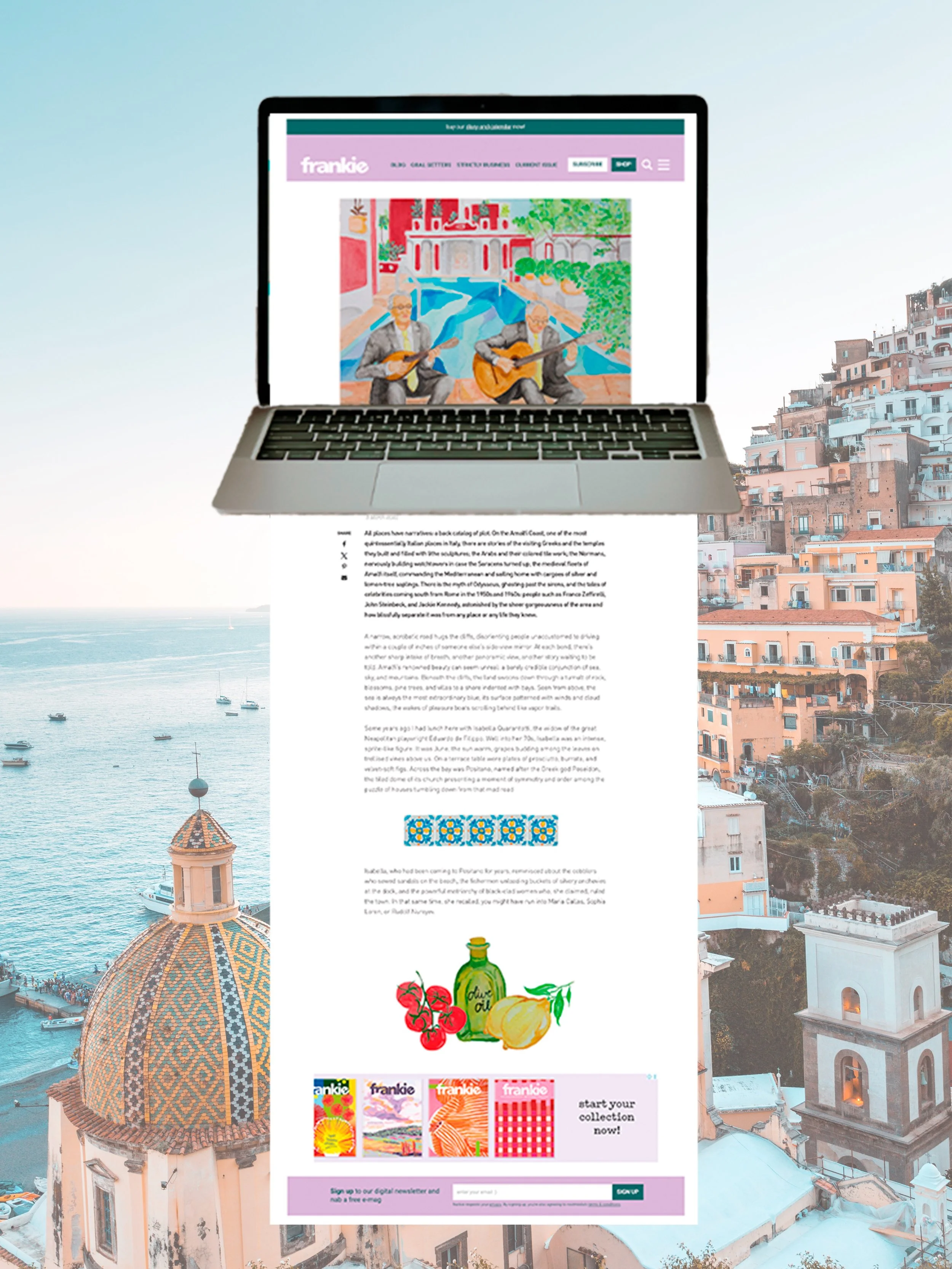
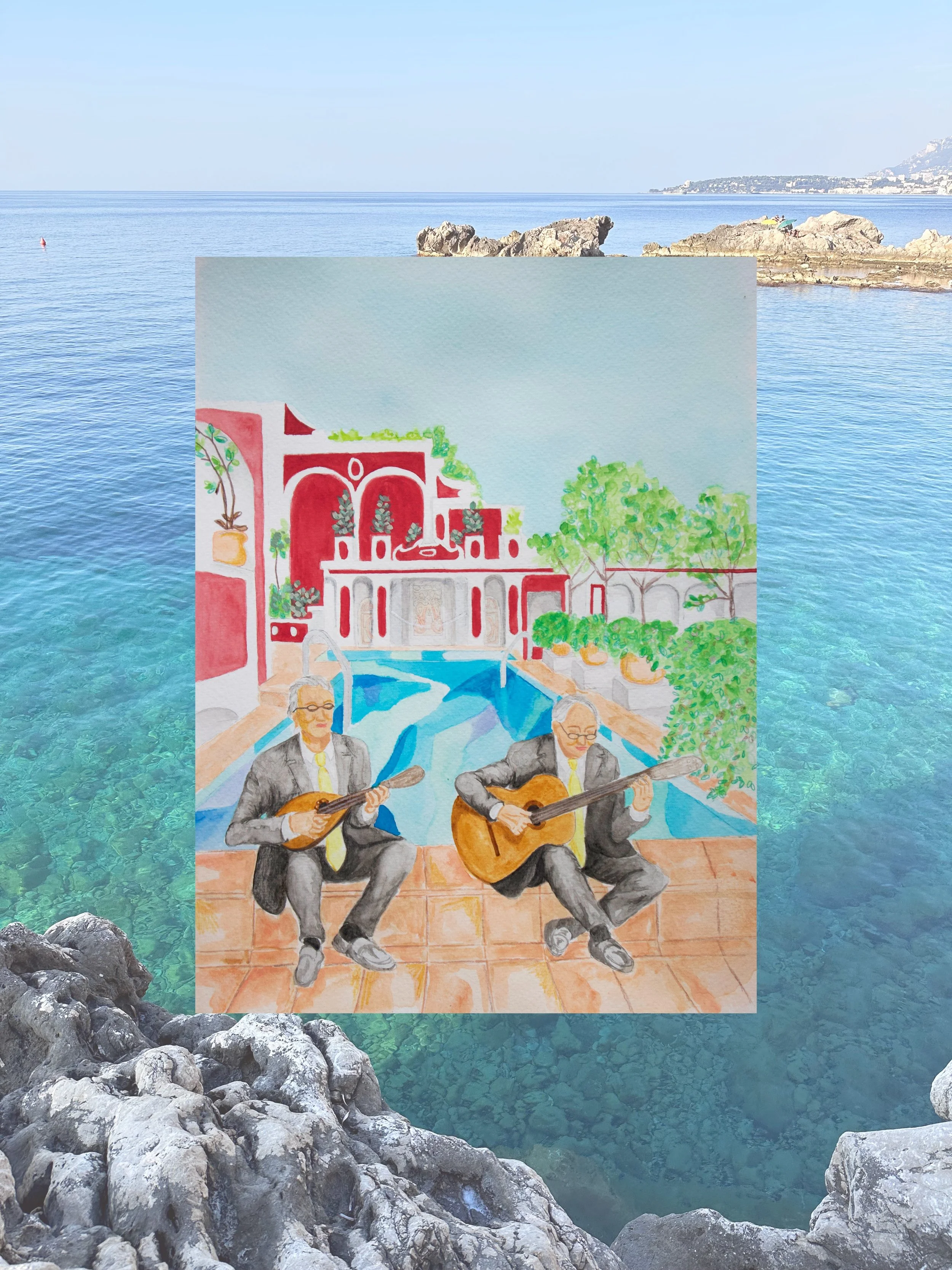
Magazine Layout
An editorial design project developed for a mock Frankie Magazine feature, exploring travel storytelling through layout, typography and image-making.
The project combines original hand-painted watercolour illustrations with considered typographic design, creating a soft, expressive visual language inspired by the Amalfi Coast. The final outcome extends across both magazine layout and EDM design, maintaining a cohesive and engaging editorial style.
The spread showcases thoughtful use of paragraph and character styles, grid systems, and visual rhythm to create a cohesive and engaging reading experience. It highlights how effective layout and type treatment can bring travel storytelling to life.